3d Prints for the Creality Falcon 2 Pro Laser Engraver

Usually I blog about coding projects I'm working on, but in this instance, I thought I'd share some links to some nifty accessories I have made and use with my Creality Falcon 2 Pro laser engraver.

Back in 2019, I purchased an Ender 3 (original) 3d printer from a supplier online. Back then, Ender 3 was more of a kit. You received a box full of individual parts and a single page of paper with some very cryptic instructions and literally no illustrations on how to assemble the printer. Luckily, I spoke to a couple of sales people at my local MicroCenter who directed me to a great video showing in great detail how to assemble the unit from scratch. I managed to build the printer without making any of my usual assembly mistakes.

My primary purpose for purchasing the printer was to make accessories for the basement workshop I had just finished building out. I lined the walls with IKEA Skadia pegboards, but rather than purchase dozens of IKEA's accessories, I planned to print my own. There are an amazing number of free 3d print files available for the Skadia pegboards. Mostly I print tool holders and sewing accessories for my wife who shares the workshop for her own projects.

Jump ahead to 2025. I'm now retired and in the course of looking for new projects to occupy my time, I got interested in laser engraving. I invested in a cheap NEJE device which cost me $40 which had a pretty pathetic 1 watt laser and a worksurface of 3-4 square inches. I made a few labeled garden stakes for my yard and engraved my wife's headshot on a piece cardboard before realizing I had to invest in a serious machine if I was going to make anything useful or artistic.

That's when I bought the Creality Falcon 2 Pro. I watched a lot of YouTube reviews of different desktop lasers, several of which seemed like good choices. I ultimately settled on the Creality unit because I'd had such good luck with the Ender 3 printer. Like a lot of people, I quickly realized that I needed to make modifications to the basic unit and build some accessories to enhance its operation. The rest of this blog provides a short list of the accessories I've 3d printed which I found most useful.

Exhaust duct

If you're just getting started with laser engraving, be aware that having a good exhaust system to vent smoke and dust from the engraver is essential. Unless you live somewhere you can work outdoors, you will quickly realize how important it is to have a good exhaust system in place. My workspace is located in our basement where we have small windows around the base that you can open from the inside. I was able to subsitute the glass window in one of the frames with one made from plexiglass to which I attached the duct and screen I list below. The vent attaches to the 70 mm inner diameter flexible duct host that comes with the Falcon laser, and has a screen to keep out small "critters".

Outlet Elbow for Smoke Extraction

The built-in exhaust port vents smoke horizontally whereas my exterior vent is located above the laser engraver. Luckily, someone designed a custom outlet elbow that easily replaces the default exhaust that comes with the Falcon 2 Pro. I'm not certain whether this helps exhaust the smoke any more effectively than simply bending the flexible duct host, but I prefer this arrangement; your preferences may differ from mine.

Honeycomb Bed Holder

The Falcon 2 Pro has a set of built-in supports to rest the material you're cutting on. These worked fine for certain projects, but I started to have problems when I worked with pieces of plywood that were not completely flat. There's really no easy way to hold the sheet of wood down with those parallel brackets in the Falcon. A lot of people recommend buying a honeycomb bed to replace the brackets. The bed provides good airflow plus there are several ways to hold wood in place during engraving.

I chose to buy a 500 mm x 500 mm bed that fits inside the laser engraver. Initially, I used a few of the brackets to support bed but later switched to setting it on a set of rubber feet that came with the bed and set it on top of the sliding drawer. This arrangement minimized airflow through the honeycomb so I began to look for a better solution. I stumbled onto this 3d print project which allows my bed to rest at the same level as the Creality brackets without obstructing the debris drawer which I access regularly for cleaning.

Magnetic Honeycomb Holdowns

I started out using different kinds of "pins" that people have designed to hold down wood on a honeycomb bed, but found that over time they wouldn't stay in place or overlapped too much of the wood's edges, or sat a bit too high and would get hit by the laser as it moved across the wood surface. I eventually discovered this set of magnetic holders which solved all these problems. They utilize large neodymium magnets to hold the edge of the wood tightly against the surface of the honeycomb bed. Two words of caution regarding magnet holdowns. One, I've heard that some beds may be made with materials that do not work with magnets. Make sure the bed you buy does before you purchase it. Two, avoid some of the 3d print objects that use small neodymium magnets. I tried a different design that held two small magnets only to find that the smaller magnets don't have strong enough attraction to keep your wood held down and prevent movement.

If I find any more useful 3d prints, I'll list them here as time goes on. Meanwhile, enjoy your Creality laser and make some interesting stuff.

Blazor QuickGrid using a Remote DataSource

And thou shalt make for it a grating of network of brass; and upon the net shalt thou make four brazen rings in the four corners thereof.
וְעָשִׂיתָ לּוֹ מִכְבָּר מַעֲשֵׂה רֶשֶׁת נְחֹשֶׁת וְעָשִׂיתָ עַל-הָרֶשֶׁת אַרְבַּע טַבְּעֹת נְחֹשֶׁת עַל אַרְבַּע קְצוֹתָיו

I really had to stretch my imagination a bit searching for a reference to a grid in the Torah. The closest word I could find was רשת which usually relates to a network. Exodus 27:4 provided the quote above. I'm guessing that most Hebrew speaking coders use the English word "grid" but part of the reason I spend time on this blog is to expand my knowledge of Biblical Hebrew so there you go.

As of .NET 8, the new QuickGrid Blazor component is officially supported. This grid is intended as a simple, flexible grid for general purpose use. It lacks a lot of features like nested grids and drag to reorder columns that are found in some commercial grid components, but it supplies enough basic functionality to make it the grid of choice in a lot of applications.

While studying the documentation found here, I didn't see code for an end-to-end sample application that leveraged a remote datasource linked to a database. There is an example that leverages a publicly available API from the US FDA Food Enforcement database, but this API seems to lack a few features that I wanted to play with that would demonstrate data sorting and filtering in addition to pagination. As such, I decided to put together a simple demo project on my own that could demonstrate a number of the features you can leverage with this simple grid component.

Source for this example can be found at https://github.com/rlebowitz/Finaltouch.QuickGrid

The Microsoft documentation recommends leveraging the QuickGrid component's ItemProvider attribute. ItemProvider is simply a delegate for a callback method that GridItemsProvider type, where TGridItem is the type of data displayed in the grid. The callback you provide must have a parameter of type GridItemsProviderRequest which specifies the start index, maximum row count, and sort order of data to return. If the grid employs paging or virtualization, your data source also needs to provide a total item count as well.

The Backend

For purposes of this demonstration, I downloaded a public SQLite database containing census information on the most popular male and female baby names grouped by US state. I constructed a pretty simple REST API that retrieves some of the records based on metadata indicating a starting index value, the maximum number of rows to retrieve, the sort order of the data as well as certain kinds of filter data. The metadata class is seen below. The SortProperty enumeration is part of the QuickGrid component library. The Filter class is I created a simple repository class that processes metadata posted to an API controller and returns a result containing a list of records matching the filter criteria.

  
 public class GridMetaData
    {
        public int StartIndex { get; set; }
        public int? Count { get; set; }
        public ICollection? SortProperties { get; set; }
        public Filter? Filter { get; set; }
    }


    public class Filter
    {
        public string? Field { get; set; }
        public string? Value { get; set; }
        public Operator Operator { get; set; } = Operator.Equals;
        public bool IsValid => Field != null && Value != null;

    }


public enum Operator
    {
        Equals,
        NotEquals,
        GreaterThan,
        LessThan,
        Contains
    }

If the metadata syntax seems a bit odd, it's because I am using the System.Linq.Dynamic.Core library to create LINQ queries dynamically from string fragments. Dynamic LINQ is worth taking a look at if like me, you want to generate filters that can be changed by controls within the grid. I couple Dynamic LINQ with some IQueryable extension methods to make it easier to construct the necessary queries based on the filter criteria.

  
        public class NamesRepository : INamesRepository
    {
        private ILogger Logger { get; set; }
        private BabynamesContext Context { get; set; }

        public NamesRepository(ILogger logger, BabynamesContext context)
        {
            Logger = logger;
            Context = context;
        }

        public NamesResult? GetBabyNames([FromBody] GridMetaData metaData)
        {
            try
            {
                var ordering = Ordering(metaData.SortProperties);
                var ordered = string.IsNullOrEmpty(ordering)
                    ? Context.Babynames.OrderBy(t => t.State)
                    : Context.Babynames.OrderBy(ordering);
                var result = ordered
                    .Filter(metaData.Filter)
                    .Select(t => t)
                    .Skip(metaData.StartIndex)
                    .Take(metaData.Count ?? 10)
                    .AsNoTracking()
                    .ToListAsync();
                var count = Context.Babynames.AsQueryable().Filter(metaData.Filter).CountAsync();

                Task.WaitAll(count, result);

                return new NamesResult
                {
                    Count = count.Result,
                    BabyNames = result.Result
                };
            }
            catch (Exception ex)
            {
                Logger.LogError(ex, "Controller Error");
            }
            return default;
        }

        //https://dynamic-linq.net/basic-simple-query#ordering-results
        private static string Ordering(ICollection? properties)
        {
            List columns = new();
            if (properties == null)
            {
                return string.Empty;
            }
            foreach (var property in properties)
            {
                if (property.Direction == SortDirection.Ascending)
                {
                    columns.Add(property.PropertyName);
                }
                else
                {
                    columns.Add($"{property.PropertyName} desc");
                }
            }
            return string.Join(", ", columns);
        }
    }

The Frontend

As the Razor code sample below shows, I've specified a callback method that matches the GridItemsProvider delegate type called NamesProvider. I've also indicated that I will be using pagination to view data in small chunks one at a time, so I don't need to leverage the Virtualize attribute for QuickGrid. I've chosen to only display a few of the data fields provided by my Sqlite database in this demo application. I specify that all the PropertyColumns are sortable, and, in order to demonstrate how to implement a search function using Dynamic Linq, I've provided an input field that will act as a filter on the State data property.


@page "/"
@using Microsoft.AspNetCore.Components;
@using Microsoft.AspNetCore.Components.Forms
@using Microsoft.AspNetCore.Components.QuickGrid
@layout Shared.MainLayout

<PageTitle>Baby Names</PageTitle>
<div class="container py-3">
    <div class="row mb-4">
        <div class="col-lg-8 mx-auto text-center">
            <h1 class="display-6">Most Popular Baby Names by State</h1>
        </div>
    </div>

    <div class="row">
        <div class="col-lg-10 mx-auto">
            <div class="grid" tabindex="-1">
                <QuickGrid @ref="Grid" ItemsProvider="@NamesProvider" Class="comic-name" Theme="default" Virtualize="false" Pagination="@Pagination">
                    <PropertyColumn Title="State" Property="@(c => c.State)" Sortable="true" IsDefaultSortColumn="true">
                        <ColumnOptions>
                            <div class="search-box">
                                <input type="search" autofocus @bind="Filter" @bind:event="oninput" placeholder="State Name..." />
                            </div>
                        </ColumnOptions>
                    </PropertyColumn>
                    <PropertyColumn Title="Name" Property="@(c => c.Name)" Sortable="true" />
                    <PropertyColumn Title="Sex" Property="@(c => c.Sex)" Sortable="true" />
                    <PropertyColumn Title="Rank" Property="@(c => c.RankWithinSex)" Sortable="true" />
                </QuickGrid>
            </div>
            <Paginator State="@Pagination" />
        </div>
    </div>
</div>

The code-behind for this Razor page contains the method matching the delegate, and illustrates how data is posted to the REST service that provides sorting, filtering, etc. specifications at the same time. Note that each time that the Filter properties are updated, I call the QuickGrid's RefreshDataAsync method to let the grid know that it needs to pull back data that reflects the changes to the Filter.


public partial class Index
    {
        [Inject]
        private HttpClient Client { get; set; } = default!;
        private GridItemsProvider<Babyname>? NamesProvider { get; set; }

        private PaginationState Pagination = new PaginationState { ItemsPerPage = 10 };
        private QuickGrid<Babyname>? Grid { get; set; }
        private string? FilterText { get; set; }
        private string? Filter
        {
            get { return FilterText; }
            set
            {
                FilterText = value;
                if (Grid != null)
                {
                    Task.Run(Grid.RefreshDataAsync);
                }
            }
        }

        protected override void OnInitialized()
        {
            NamesProvider = Provider;
        }

        private async ValueTask<GridItemsProviderResult<Babyname>> Provider(GridItemsProviderRequest<Babyname> request)
        {
            GridItemsProviderResult<Babyname> result = default;
            var metaData = new GridMetaData
            {
                StartIndex = request.StartIndex,
                Count = request.Count,
                SortProperties = request.GetSortByProperties().ToArray(),
                Filter = new Filter { Field = "state", Operator = Operator.Contains, Value = FilterText },
            };
            var namesResult = await GetNames(metaData);
            if (namesResult != null)
            {
                result = new GridItemsProviderResult<Babyname>()
                {
                    Items = namesResult.BabyNames != null ? namesResult.BabyNames : Array.Empty<Babyname>(),
                    TotalItemCount = namesResult.Count
                };
            }
            return result;
        }

        public async Task<NamesResult?> GetNames(GridMetaData metaData)
        {
            var response = await Client.PostAsJsonAsync("api/BabyNames/GetBabyNames", metaData);
            if (response.IsSuccessStatusCode)
            {
                return await response.Content.ReadFromJsonAsync<NamesResult>();
            }
            return null;
        }
    }

A Blazor Modal Component Based on Bootstrap 5

According to all that I show thee, after the pattern of the tabernacle and the pattern of all the instruments thereof, even so shall ye make it.
כְּכֹל אֲשֶׁר אֲנִי מַרְאֶה אוֹתְךָ אֵת תַּבְנִית הַמִּשְׁכָּן וְאֵת תַּבְנִית כָּל-כֵּלָיו וְכֵן תַּעֲשׂוּ

Exodus 25:9 uses the Hebrew word תבנית (tavniyt) to describe a pattern or template. The word derives from the root בנה which relates to building (construction).

Source can be found at https://github.com/rlebowitz/Finaltouch.Modal

Demo can be found at https://rlebowitz.github.io/Finaltouch.Modal/

I often need to use a modal control for editing small forms in my applications. While it would be possible to write such a control from scratch, it's much simpler to adapt an existing modal for this purpose. I like using Bootstrap 5 these days so I'm presenting the code for a Blazor version of their modal here.

The Bootstrap 5 modal design includes three subsections; a header, body and footer. The header generally includes a title and as the documentation recommends, a dismiss action (means to close the modal). You can of course, incorporate different header content, but I provide an approach that displays a header if you pass a title value, along with a dismiss action. The Razor code below shows a template that incorporates these features.

  
   <div tabindex="-1" class="modal fade @ModalZoom @ModalClass" style="display: @ModalDisplay" @attributes="AriaAttributes">
    <div class="modal-dialog @ModalScroll @ModalCentered">
        <div class="modal-content">
            @if (Title != null)
            {
                <div class="modal-header">
                    <h5 class="modal-title">@Title</h5>
                    <button class="btn-close" data-dismiss="modal" aria-label="Close" @onclick="Close">
                    </button>
                </div>
            }
            <div class="modal-body">
                @Body
            </div>
            @if (Footer != null)
            {
                <div class="modal-footer">
                    @Footer
                </div>
            }
        </div>
    </div>
</div>

<div class="modal-backdrop fade @ModalClass" style="display: @ModalDisplay"></div>


Looking at the C# code-behind, you'll see a few useful parameters that can be used to alter the behavior of the modal. You can switch between the "standard" animation where the modal appears to drop vertically into view, or use a zoom-like animation. You can center the dialog within the view, and you can add a scrollbar to the modal itself, provided that the content is sufficiently long, instead of using the scrollbar for the entire viewport that will appear automatically. I thought it would be fun to provide some scrollable content using a Hebrew Ipsum Lorem text generator.

There's very little actual code or logic required in this component. I automatically add the various aria attributes that you would see using the regular Javascript version of the Bootstrap component. One important feature to pay attention to are the Task.Delay() statements I utilize in the Open() and Close() methods. These are used to ensure that you can actually see the animation effects; without the delays the cool animations would have no time to complete their execution.


using Microsoft.AspNetCore.Components;

namespace Finaltouch.Modal.App.Shared
{
    /// <summary>
    /// A Blazor Modal Template Component
    /// </summary>
    public partial class DialogTemplate
    {
        [Parameter]
        public RenderFragment? Body { get; set; }
        [Parameter]
        public RenderFragment? Footer { get; set; }
        [Parameter]
        public string? Title { get; set; }
        [Parameter]
        public bool UseZoom { get; set; }
        [Parameter]
        public bool Scrollable { get; set; }
        public bool Centered { get; set; } = true;
        private string ModalDisplay { get; set; } = "none";
        private string ModalClass { get; set; } = string.Empty;
        private string ModalZoom => UseZoom ? "modal-zoom" : string.Empty;
        private string ModalScroll => Scrollable ? "modal-dialog-scrollable" : string.Empty;
        private string ModalCentered => (Centered && !Scrollable) ? "modal-dialog-centered" : string.Empty;

        private Dictionary<string, object> AriaAttributes
        {
            get
            {
                var attributes = new Dictionary<string, object>();
                if ("block".Equals(ModalDisplay))
                {
                    attributes.Clear();
                    attributes.Add("aria-modal", "true");
                    attributes.Add("role", "dialog");
                }
                else
                {
                    attributes.Clear();
                    attributes.Add("aria-hidden", "true");
                }
                return attributes;
            }
        }

        public async Task Open()
        {
            ModalDisplay = "block";
            await Task.Delay(200);
            ModalClass = "show";
        }

        public async Task Close()
        {
            ModalClass = string.Empty;
            await Task.Delay(200);
            ModalDisplay = "none";
        }

    }
}

Some of the code and inspiration for this component came from this thread on Stack Overflow. It's worth reading to see how other folks have created modal components based on Bootstrap.

A Cross-platform Drag and Drop library for Blazor Part II

In Part I, I walked through the details of simple JavaScript module I created to support drag and drop functionality in Blazor. In this post I will go over the design of the C# class which leverages the JavaScript module and provides the ability to send movement data to Blazor components.


        public DragDropInterop(IJSRuntime jsRuntime)
        {
            ModuleTask = new(() => jsRuntime.InvokeAsync<IJSObjectReference>(
                "import", "./_content/Finaltouch.DragDrop.Components/dragDropInterop.js").AsTask());
            ObjRef = DotNetObjectReference.Create(this);
        }

        public async ValueTask Initialize(Func<DragDropResult, Task>? func, DragDropOptions options)
        {
            if (func == null)
            {
                throw new ArgumentNullException(nameof(func));
            }
            Func = func;
            options ??= new DragDropOptions();
            JsonSerializerOptions SerializerOptions = new()
            {
                PropertyNamingPolicy = JsonNamingPolicy.CamelCase,
                WriteIndented = false,
            };
            var jsonString = JsonSerializer.Serialize(options, SerializerOptions);
            var value = await ModuleTask.Value;
            await value.InvokeVoidAsync("initialize", ObjRef, jsonString);
        }
        
        public async ValueTask AddListeners()
        {
            var value = await ModuleTask.Value;
            await value.InvokeVoidAsync("addListeners");
        }

        [JSInvokable]
        public async Task OnPointerUp(DragDropResult result)
        {
            if (Func != null)
            {
                await Func(result);
            }
        }

The DragDropInterop class is intended for use as a dependency injection service. Following best practices described in the Microsoft documentation and examples for JavaScript interoperability, I use lazy instantiation to create a reference to the JavaScript module. Three exported methods are called by this class. Before any drag and drop functionality can be used, you have to call Initialize() on this class. Initialize receives a Func delegate and any non-default options that you want to specify, for example whether to disable sorting or non-default classnames for containers and draggable items in your Blazor components. The Func delegate is is used so you can apply changes to the component UI. It's deliberately meant to call an async method so that you can easily call external REST services, etc. when you update your UI.

The second method AddListeners() is called after Initialize has completed. You might wonder why I didn't simply add my task / item listeners as part of the initialization process. The reason is simple. The Func delegate we pass to this class must call StateHasChanged() in order to signal the Blazor framework that the UI needs to be updated. Remember that this JavaScript module was specifically designed not to mutate the DOM. The delegate makes sure that all DOM changes are managed by Blazor. Unfortunately, when you call StateHasChanged(), any event listeners which we added earlier are removed, thus we have to add back new ones before we can initiate another drag and drop operation. You call AddListeners() in the OnAfterRenderAsync() method of your Blazor components so that any task/item elements to which you add listeners are already created in the DOM.

The OnPointerUp() method is called by the JavaScript module when the user releases a mouse button, or removes their finger from a touch screen, etc. Note that the method is only called if a change in the DOM needs occurred. If the the pointer is released when it is not located over a container (target), then there is really no need to update the DOM.


	builder.Services.AddScoped(typeof(DragDropInterop));

Be sure to remember to register this service in the Program.cs class of your WASM client project so you can inject it into your Blazor pages and components. In Part III we'll examine my demo project to give you a better idea of how to apply this library in your own applications. Remember, all the code here is available from my public GitHub repository.

A Cross-platform Drag and Drop library for Blazor - Part 1

There is a long standing request from the Blazor development community for Microsoft to provide support for drag and drop functionality. In an article from Visual Studio Magazine (3/30/2022), author David Ramel details past efforts made towards adding this feature, but sadly, Blazor development manager Daniel Roth; "After investigating various approaches we've decided that a general purpose drag & drop feature isn't something we can easily add to the Blazor framework."

Like a few other developers, I experimented with the HTML5 Drag and Drop API, but its primary shortcoming is that it is not fully supported by some browsers, in particular mobile browsers. Roth's recommendation is to leverage JavaScript interoperability and rely on use of a JavaScript library for this functionality.

The Ramel article cites a 2021 presentation by Blazor creator Steve Sanderson which demonstrates use of the draggable.js library to create a calendar appointment application. I tried my hand at integrating draggable.js, as well as a few other well-known JavaScript libraries like lmdd.js (Lean and Mean Drag and Drop) and dragula.js (the name is rather clever) but found all of them lacking, at least for the use cases I have in mind.

The biggest problem with all of the libraries is that they mutate the Document Object Model (DOM), which according to the Blazor JavaScript interop documentation is a cardinal sin. It makes sense that you don't want to muck around under the covers with the DOM given how Blazor follows a different paradigm that says, "don't worry about the DOM, we'll manage that in our framework". Indeed, I quickly discovered that every time you call StateHasChanged() or initiated an automatic rerendering of the UI by changing parameter values, or use of an EventCallBack, any changes made by these third party libraries disappeared, or altered the drag and drop behavior in unexpected ways.

After numerous failed experiments using other peoples' libraries, I decided to create my own simple drag and drop JavaScript library that does not mutate the DOM. By using specific JavaScript events (pointerdown, pointermove and pointerup), my library displays the movement of objects on the screen, and uses a JSInvokable method to send data on what changes were made back to a .NET object. That object in turn, sends the data to one or more Blazor components which handle any changes to the UI.

I'll explain this process by walking through an example and showing the associated code. You can find all the code presented here, and a working sample in my GitHub repository. I noticed that a number of drag and drop demos are a form of draggable ToDo list. I borrowed the design of my sample from a demo created for lmdd.js. In the figure shown below, there are three colored containers labeled Tasks, High Priority and Done. I've predefined some tasks and placed some in each of the first two containers. The application is designed so that a user can drag a given task by it's handle (the menu hamburger icon on the left side of each task) to either of the other containers. In a later post, I'll demonstrate how to add some logic to limit where a task can be placed, but for now, any task can be dragged to any container.

Demo available at: https://rlebowitz.github.io/Finaltouch.DragDrop/

The two most important items in my solution are the JavaScript module, DragDropInterop, and the the C# class, DragDropInterop.cs which uses Javascript Interoperability to call specific methods and pass data to the module, and receives data sent back from the module at the end of a drop event. The post (Part I) will focus on the JavaScript module, my next blog post will discuss its C# counterpart.


function DragDropInterop() {
    let options, draggingElement, rect, sourceContainerId, sourceItemId, raf;
    let x, y, deltaX, deltaY;
    x = y = deltaX = deltaY = 0;

    /**
        Default options which can be overridden by passing in a DropDropOptions object 
     */
    const defaults = {
        componentClass: 'dd-component',
        containerClass: 'dd-container',
        itemClass: 'dd-item',
        handleClass: 'handle',
        sort: true
    };
    
    /**
     * Method used to merge DragDropOptions (C#) values with the predefined default option values.
     * Values passed in override the defaults automatically.
     * @param {any} settings
     */
    const assignOptions = function (settings) {
        var target = {};
        Object.keys(defaults).forEach(function (key) {
            target[key] = (Object.prototype.hasOwnProperty.call(settings, key) ? settings[key] : defaults[key]);
        });
        options = target;
    };

    /**
     * Public exported method used to initialize the various options associated with this module and 
     * store the DotNet object used to call methods labeled with JSInvokable.
     * @param {any} helper - the specified DotNet object
     * @param {any} jsonOptions - the serialized DragDropOptions object
     */
    this.initialize = function (helper, jsonOptions) {
        dragDropHelper = helper;
        // assign the options
        assignOptions(JSON.parse(jsonOptions));
    };
    
    ...
}

The initialize method is early in the lifecycle of any Blazor page or component that will use drag and drop. It accepts a JSON serialized object specifying CSS class values used to identify container, task item and handle elements in the DOM. There is also an option to determine whether to sort objects or not. In the current application, sorting is useful so I've set the property value to true. I added the ability to disable this functionality since there are likely other applications where sorting isn't used.


    /**
     * Method used to add event listeners to all of the draggable items/elements.
     */
    this.addListeners = function () {
        let items = Array.from(document.querySelectorAll(`.${options.itemClass}`));
        items.forEach(item => {
            item.addEventListener('pointerdown', pointerDown, { passive: true });
            if (!options.handleClass) {
                // change the item's cursor to the move cursor
                item.classList.add('moveCursor');
            }
            else {
                let handle = item.querySelector(`.${options.handleClass}`);
                if (!!handle) {
                    handle.classList.add('moveCursor');
                }
            }
        });
    };
    /**
     * Method used to remove the event listeners from all draggable items/elements.
     */
    const removeItemListeners = function () {
        let items = Array.from(document.querySelectorAll(`.${options.itemClass}`));
        items.forEach(item => {
            item.removeEventListener('pointerdown', pointerDown, { passive: true });
        });
    };

The next two methods are (obviously) used to add and remove a pointerdown event to each task item element in the DOM. The addListeners method is exported by the module; the removeItemListeners method is a private method called internally. Note that I've added a feature to change the cursor that appears when the cursor is over an item or its handle. I used handles in my app but you could have the cursor modified for the entire item by specifying the handleClass option as an empty string. You'll note that at this point in time, only event listeners for the pointerdown event are applied. This is deliberate; we don't want to listen for the other events just yet. I've used the various pointer events for convenience sake. These events allow the application to accept input from a mouse, touchscreen or other input device. In some third party libraries I've seen developers specify many different kinds of listeners to handle the different types of input; the pointer events seemed more convenient since they require less coding.


    /**
     * Private method called when the left button of a mouse is held down, or a touch screen is touched on
     * a draggable item/element.
     * @param {any} event - a 'pointerdown' event.
     */
    const pointerDown = function (event) {
        if (options.handleClass && event.target.classList.contains(options.handleClass)) {
            // the handle is presumably within the draggable item, so locate the item itself
            draggingElement = event.target.closest(`.${options.itemClass}`);
        }
        else {
            if (event.target.classList.contains(options.itemClass)) {
                draggingElement = event.target;
            }
            else {
                draggingElement = event.target.closest(`.${options.itemClass}`);
            }
        }
        if (!!draggingElement) {
            draggingElement.classList.add('dragging');
            x = event.clientX;
            y = event.clientY;
            rect = draggingElement.getBoundingClientRect();
            var container = draggingElement.closest(`.${options.containerClass}`);
            if (container) {
                sourceContainerId = container.dataset.containerId;
                sourceItemId = draggingElement.dataset.itemId;
            }
            document.addEventListener('pointermove', pointerMove, { passive: true });
            document.addEventListener('pointerup', pointerUp, { passive: true });
        }
    }

The pointerdown event handler is where we begin to track dragging movement. The initial code just identifies the actual element being dragged based on whether you are using a handle or not. After that we begin to store the input device's initial coordinates and those of the bouding rectangle of the element we're dragging. Next, we identify the container (task list) that the task element we're dragging is located in initially, as well as the unique identifier of the task item. Both these pieces of data are important to have when we send data back to the C# object that uses this module. In my component implementations I automatically assign random container and item identifiers using data attributes. These values are used in a couple of ways as will be shown later. Finally, I add the pointermove and pointerup event listeners to the document itself. In my application the ToDo component is the only component that will use drag and drop. In other applications, you may want to place your code in a top level div element and apply the listeners to that element instead. I found that if I went outside the boundary of my ToDo component, seen as a black border, the drag and drop functionality would stutter. The technical term I've seen used to describe this behavior is janky.


    /**
     * Private method called when the mouse or pointer device is moved.  
     * This method is called very frequently.  The request animation frame API is 
     * leveraged to smooth the appearance of dragging the item/element.
     * @param {any} event - a 'pointermove' event.
     */
    const pointerMove = function (event) {
        if (!raf) {
            deltaX = event.clientX - x;
            deltaY = event.clientY - y;
            raf = requestAnimationFrame(pointerMoveRAF);
        }
    };
    /**
     * Private method called by the request animation frame that animates the item/element's movement.
     * Once the element is finished rendering the frame variable is released to allow the next rendering.
     */
    const pointerMoveRAF = function () {
        draggingElement.style.transform = `translate3d(${deltaX}px, ${deltaY}px, 0px)`;
        raf = null;
    };

The two methods listed above are where the animation magic used to make the task element appear to move across the screen occurs. The pointerMove event handler method leverages the Request Animation Frame API which is designed to render the UI at a much higher frame rate. The important thing to remember is that the movement is simulated, there is no actual physical change to the DOM taking place.


    /**
     * Private method called when the mouse button or pointer device is released (dragging has completed).
     * @param {any} event - 'pointerup' event
     */
    const pointerUp = function (event) {
        // clean up
        document.removeEventListener('pointermove', pointerMove);
        document.removeEventListener('pointerup', pointerUp);
        // if the animation frame rendering was in process when the button or pointer device was release,
        // this will cancel the scheduled rendering.
        if (raf) {
            cancelAnimationFrame(raf);
            raf = null;
        };
        draggingElement.style.left = `${rect.left + deltaX}px`;
        draggingElement.style.top = `${rect.top + deltaY}px`;
        draggingElement.style.transform = 'translate3d(0px,0px,0px)';
        if (deltaX == 0 && deltaY == 0) {
            // item wasn't moved, so ignore the event
            return;
        }
        deltaX = deltaY = 0;
        // locate the container on which the item/element was dropped (if any)
        let element = document.elementFromPoint(event.clientX, event.clientY);he 
        let container = element.closest(`.${options.containerClass}`);
        if (container) {
            let afterElement;
            if (options.sort) { 
                afterElement = getDragAfterElement(container, event.clientY);
            }
            let targetItemId = !!afterElement ? afterElement.dataset.itemId : '';
            // create result object
            let result = new DragDropResult(sourceItemId, sourceContainerId, targetItemId, container.dataset.containerId);
            // remove the listeners to avoid possible memory leaks
            removeItemListeners();
            // pass back the DragDropResult to the C# object
            dragDropHelper.invokeMethodAsync('OnPointerUp', result);
        }
    }

The final event handler has several key functions. The first half of the code used to clean up a few things; remove the pointermove and pointerup event listeners, cancel the animation, and reset a couple of the module variables. The second half is going to gather data on which container and (if applicable) where the task item was dropped within the container. Note that if you don't drop the task item on a container, the task will simply remain where it was when you began dragging it. At the very end of this method we perform some cleanup by removing all the pointerdown event listeners, and finally we call the method OnPointerUp in the C# object that uses this module and passes it four pieces of data; the unique identifiers of the initial (source) container, the task item we dragged, the target container where we dropped the task item, and, if one exists, the task item upon which the dragged item was dropped.

There is one last vital bit of information that I need to add related to the pointermove event. There is another event called pointercancel which will have a deleterious effect on drag and drop functionality when you use a touch device like touch screens on mobile devices. If you want all the technical details, I suggest you check out this article. In a nutshell, we have to provide a small fix to the CSS that we apply to our tasks / items. Just add a touch-action: none to the item CSS and this problem is solved. By the way, you can't apply touch-action programmatically; once you start a gesture, applying element.style.touchAction = 'none' will have no effect! Just stick to defining it in a CSS class and you're all set.


    /**
     * Private method used to determine where the dragged item/element should be placed if sorting is enabled.
     * @param {any} container - the container on which the item/element was dropped.
     * @param {any} y - The y coordinate of the mouse or pointer device when the item was dropped.
     * @returns The element after which the dragged item/element should be inserted.  If the return value is null
     * the dragged item should be appended to end of the container's items.
     */
    const getDragAfterElement = function (container, y) {
        const draggableElements = [...container.querySelectorAll(`.${options.itemClass}:not(.dragging)`)];

        return draggableElements.reduce((closest, child) => {
            const box = child.getBoundingClientRect();
            const offset = y - box.top - box.height / 2;
            if (offset < 0 && offset > closest.offset) {
                return { offset: offset, element: child }
            } else {
                return closest
            }
        }, { offset: Number.NEGATIVE_INFINITY }).element
    }

I wish I could take credit for this last little bit of code, it's a very clever way to figure out where in an existing task list you have dropped the task item. It essentially figures out which existing task item in a list is closest to where you're dropping the dragged task item, and whether the dragged item is above or below the center of the existing task's x-axis. I found this snippet here. I only call this method if the sort option is set to true. Otherwise, we assume that the dropped item is appended to the end of the task list, and not necessarily somewhere within the list.

I'll detail the C# class that leverages all the JavaScript code in Part II.

Style Color Methods for Blazor

ו[יעקב] עשה לו [ליוסף] כתונת פסים. (פרשת וישב)

And [Jacob] made him [Joseph] a striped shirt.

I would wager that the best known reference to color in the Torah is found in Genesis 37:3. The King James translation describes Jacob's gift as a coat of many colors, yet the Hebrew phrase may not actually carry that meaning. In Modern Hebrew, the word passim refers to stripes. Some commentators over the centuries have described the coat (or tunic, or robe) as having multicolored stripes, but there is no universal agreement on the translation. In any event, this phrase provides a great title for the musical adaptation of Joseph's life by Andrew Lloyd Weber and Tim Rice.

While working on a new Razor component, I wanted to create a class to store CSS style values that I could pass as a parameter. I incorporate CSS variables in my stylesheets so that I can modify the appearance of components by constructing inline-style strings.

In one case, I wanted to select a base color, and be able to quickly derive both a lighter and darker variant of the color programmatically. Using some simple calculations, I can avoid having to define every single color I employ in my component; I just choose the base color and the variants are generated on the fly. It turns out that this is pretty easy to do if you work with RGB colors. To create a darker shade of a specified color, you can use the following method:


public static Color Shade(this Color color, double percentage = 0.25)
{
	return Color.FromArgb(Round(color.R * percentage), Round(color.G * percentage), Round(color.B * percentage));
}

private static int Round(double d)
{
	return d < 0 ? (int)(d - 0.5) : (int)(d + 0.5);
}

By specifying a percentage (any value between 0.0 and 1.0 - I use 25% or 0.25 as a default), you can generate a darker shade quickly. Note that I've provided a simple rounding method that converts double values to integers. The built-in Math.Round() method didn't quite work as I expected it to, so I whipped up this simple alternative method.

Generating a lighter tint is equally simple. The code for that is:


public static Color Tint(this Color color, double percentage = 0.25)
{
	return Color.FromArgb(Round(color.R + percentage * (255 - color.R)),
    	Round(color.G + percentage * (255 - color.G)), Round(color.B + percentage * (255 - color.B)));
}

Since I'm ultimately passing the colors I generate as hexadecimal string values to the style attribute of my components, I use a simple helper method to convert Color structs to hexadecimal strings:


public static string ToHexString(this Color color)
{
	return $"{color.R:X2}{color.G:X2}{color.B:X2}";
}

Remember to prepend a hash character (#) to the hexadecimal string before passing the color value to the style attribute, otherwise the browser won't know how to interpret it.

A couple of other helper methods that are useful if your base color is expressed as one of the many named colors, or a hexadecimal string:

public static Color NameToColor(string colorName)
{
	var value = Color.FromName(colorName);
    return value.IsNamedColor ? value : default;
}

public static Color HexStringToColor(string hex)
{
	var match = Regex.Match(hex);
    if (match.Success)
    {
    	var hexString = match.Groups[1].Value;
        var intValue = int.Parse(hexString, System.Globalization.NumberStyles.HexNumber);
        return Color.FromArgb(intValue);
	}
    return default;
}

private static readonly Regex Regex = HexRegex();

[GeneratedRegex("^#?([A-Fa-f\\d]{2}[A-Fa-f\\d]{2}[A-Fa-f\\d]{2})$", RegexOptions.Compiled)]
private static partial Regex HexRegex();


A Blazor Markdown Editor and Previewer for English and Hebrew

As part of one of my passion projects I figured out it was easier to store the contents of some web components as Markdown rather than as HTML strings. There are a number of examples of Blazor Markdown editor components out there, but most of them lack a Previewer and none of them was designed for both English and Hebrew Markdown.

Adding this Markdown editor to a Blazor page is simple enough:


@page "/"

<PageTitle>Index</PageTitle>

<h2>Markdown Editor</h2>

<HebrewMarkdownEditor @bind-Markdown="MarkdownText"></HebrewMarkdownEditor>

The code behind is equally simple:


public partial class Index
    {
        private string MarkdownText { get; set; } = string.Empty;
        
    }

The Razor code for the editor is fairly simply. It leverages an HTML textarea element which uses a few simple Javascript tricks to expand in height as needed based on the size of the Markdown text content. The editor utilizes a separate modal component to display the Markdown as it would appear on a web page. The editor is designed to detect when the Markdown contains Hebrew characters in order to automatically switch the direction of the textarea contents from left-to-right to right-to-left.


<div dir="@Direction">
    <textarea @ref="Element" class="form-control" @bind-value="Markdown" @bind-value:event="oninput" @onkeyup="OnInput">
            </textarea>
    <span class="fa fa-solid fa-eye @Position" title="Preview" aria-hidden="true" @onclick="OnPreview"></span>
</div>
<MarkdownPreviewModal MarkdownText="@Markdown" @bind-Display="Display" @bind-Display:after="OnAfterPreview"></MarkdownPreviewModal>


public partial class HebrewMarkdownEditor : ComponentBase, IAsyncDisposable
    {
        [Inject]
        private IJSRuntime? JSRuntime { get; set; }
        [Parameter]
        public string? Markdown { get; set; } = string.Empty;
        [Parameter]
        public EventCallback<string> MarkdownChanged { get; set; }
        private IJSObjectReference? Module { get; set; }
        private bool Display { get; set; } = false;
        private string Direction => Markdown != null && Markdown.IsHebrew() ? "rtl" : "ltr";
        private string Position => Markdown != null && Markdown.IsHebrew() ? "left" : "right";
        private ElementReference Element { get; set; }

        protected override async Task OnAfterRenderAsync(bool firstRender)
        {
            if (firstRender && JSRuntime != null)
            {
                Module = await JSRuntime.InvokeAsync<IJSObjectReference>("import", "./_content/Blazor.HebrewMarkdown.Components/textArea.js");
                if (Module != null)
                {
                    await Module.InvokeVoidAsync("initialize", null);
                }
            }
            if (Module != null)
            {
                await Module.InvokeVoidAsync("setHeight", Element);
            }
            await base.OnAfterRenderAsync(firstRender);
        }

        private async Task OnInput(KeyboardEventArgs args)
        {
            if (args.AltKey && (args.Key == "p" || args.Key == "פ"))
            {
                Display = true;
                return;
            }
            if (MarkdownChanged.HasDelegate)
            {
                await MarkdownChanged.InvokeAsync(Markdown);
            }
        }

        private void OnPreview()
        {
            Display = true;
        }

        private async Task OnAfterPreview()
        {
            await Task.Run(async () => await Element.FocusAsync());
        }

        async ValueTask IAsyncDisposable.DisposeAsync()
        {
            if (Module is not null)
            {
                await Module.DisposeAsync();
            }
        }
    }

Note that the editor calls two bits of Javascript code; one to add and event listener for input events on the textarea, the other calls a method that resets the height of textarea based on the size of the textarea's content.


export function setHeight(element) {
    element.style.height = 'inherit';
    // Get the computed styles for the element
    var computed = window.getComputedStyle(element);
    // Calculate the height
    var height = parseInt(computed.getPropertyValue('border-top-width'), 10)
        + parseInt(computed.getPropertyValue('padding-top'), 10)
        + element.scrollHeight
        + parseInt(computed.getPropertyValue('padding-bottom'), 10)
        + parseInt(computed.getPropertyValue('border-bottom-width'), 10);
    element.style.height = height + 'px';
}

export function initialize() {
    document.addEventListener('input', function (event) {
        if (event.target.tagName !== 'TEXTAREA') return;
        setHeight(event.target);
    }, false);
}

I added two mechanisms to display the Markdown preview modal; one uses a hot key (Alt+p or Alt+פ). The other mechanism requires you to click on the eye icon displayed in the lower left or right corner of the textarea (depending on whether you are using LTR or RTL text). Note that the editor can automatically determine what direction should be set through use of the simple extension method below.

  
  public static partial class StringExtensions
    {
        [GeneratedRegex("\\p{IsHebrew}+", RegexOptions.Compiled)]
        private static partial Regex HebrewRegex();
        private static Regex Hebrew { get; set; } = HebrewRegex();
        public static bool IsHebrew(this string s)
        {
            return !string.IsNullOrEmpty(s) && Hebrew.IsMatch(s);
        }

    }


The final part of the editor is the Markdown previewer. It's based on a blazor-ised version of the Bootstrap modal component. Like the editor, it detects whether the Markdown contains any Hebrew text, and adjusts the direction of the text displayed accordingly.


<div @ref="Control" class="modal fade @Show" tabindex="-1" role="dialog" style="display: @DisplayType;" 
    @onkeydown="@(async (e) => await OnKeyDown(e))">
    <div class="modal-dialog modal-xl">
        <div class="modal-content">
            <div class="modal-header">
                <h6 class="modal-title">@Title</h6>
                <span class="fa-regular fa-rectangle-xmark" title="Close" aria-hidden="true" @onclick="(async () => await OnClose())"></span>
            </div>
            <div class="modal-body" dir="@Direction">
                @PreviewText
            </div>
        </div>
    </div>
</div>

@if (Display)
{
    <div class="modal-backdrop fade @Show"></div>
}

  
  public partial class MarkdownPreviewModal
    {
        [Parameter]
        public string? MarkdownText { get; set; } = string.Empty;
        [Parameter]
        public bool Display { get; set; } = false;
        [Parameter]
        public EventCallback<bool> DisplayChanged { get; set; }
        [Parameter]
        public string? Title { get; set; } = "Markdown Preview";
        private ElementReference Control { get; set; }
        private string? Show { get; set; }
        private string? DisplayType { get; set; }
        private MarkupString? PreviewText { get; set; }
        private MarkdownPipeline? Pipeline { get; set; }
        private string Direction => MarkdownText != null && MarkdownText.IsHebrew() ? "rtl" : "ltr";

        protected override async Task OnInitializedAsync()
        {
            Pipeline = new MarkdownPipelineBuilder()
                .UseAdvancedExtensions()
                .UseBootstrap()
                .Build();
            await base.OnInitializedAsync();
        }

        protected override async Task OnParametersSetAsync()
        {
            if (Display)
            {
                DisplayType = "block";
                await Task.Delay(150);  // provide a very small delay between block and show to allow for the transition (.15s)
                Show = "show";
                await Task.Run(async() => await Control.FocusAsync());
            }
            PreviewText = (MarkupString)Markdown.ToHtml(MarkdownText ?? string.Empty, Pipeline);
        }

        private async Task OnKeyDown(KeyboardEventArgs args)
        {
            if (args.AltKey && (args.Key == "c" || args.Key == "צ"))
            {
                await OnClose();
            }
        }

        private async Task OnClose()
        {
            Show = string.Empty;
            await Task.Delay(150);
            DisplayType = "none";
            if (DisplayChanged.HasDelegate)
            {
                await DisplayChanged.InvokeAsync(false);
            }
        }

    }


You can close the previewer using the hotkey Alt+c or Alt+צ or click on the close icon in the upper right hand corner of the previewer.

All the source code for this editor can be found in this Github repository.

An Enumeration-based Dropdown for WASM Blazor

This is the enumeration of the Sons of Israel    וּבְנֵ֣י יִשְׂרָאֵ֣ל לְֽמִסְפָּרָ֡ם

I found the above reference to enumeration in Chronicals 27:1 that seemed appropriate. The Hebrew word (l'misparam) here comes from the root ספר which is a bit unusual in that it has a couple of different meanings. In this instance, it relates to counting, but in other contexts it relates to writing.

I've often used dropdown controls that derive their dropdown items from a collection of values taken from a database. For some dropdowns where only a few items are needed whose values don't frequently change it may be simpler to use a dropdown that uses an enumeration as a data source.

I've created a sample enumeration called Desserts shown below. I'll elaborate on the use of the Display attribute momentarily.

  
   public enum Dessert
    {
        [Display(Name ="Chocolate Cake")]
        ChocolateCake,
        Baklavah,
        [Display(Name = "Fruit Compote")]
        FruitCompote,
        Tiramisu,
        [Display(Name = "Toffee Squares")]
        ToffeeSquares
    }


The Razor code seen here is very similar to the code I used for my generic dropdown . I make use of the Enum.GetValues() method to iterate over the various values found in my Desserts enumeration.


@typeparam TEnum
<div class="dropdown" @onfocusout="OnFocusOut">
    <button class="btn btn-primary dropdown-toggle @(Show ? "show" : string.Empty)" data-toggle="dropdown" type="button" @onmousedown="OnLabelMouseDown" aria-haspopup="true" aria-expanded="false">
        @Label
    </button>
    <div class="dropdown-menu @(Show ? "show" : string.Empty)">
        @{
            foreach (var enumValue in Enum.GetValues(typeof(TEnum)).Cast<TEnum>())
            {
                <button class="dropdown-item" type="button" @onmousedown="(() => OnItemMouseDown(enumValue))">@enumValue.DisplayName()</button>
            }
        }
    </div>
</div>


The C# code-behind is seen below:

  
public partial class EnumDropDown<TEnum> where TEnum : struct, Enum?
    {
        [Parameter]
        public EventCallback<TEnum?> Callback { get; set; }
        [Parameter]
        public TEnum? Selected { get; set; } = null;
        [Parameter]
        public string DefaultLabel { get; set; } = "Select";
        public string? Label => Selected == null ? DefaultLabel : Selected.DisplayName();
        private bool Show { get; set; } = false;

        private void OnFocusOut()
        {
            Show = false;
            StateHasChanged();
        }

        public void OnLabelMouseDown()
        {
            Show = !Show;
        }

        public async Task OnItemMouseDown(TEnum? item)
        {
            Show = false;
            if (item != null)
            {
                if (Callback.HasDelegate)
                {
                    await Callback.InvokeAsync(item);
                }
            }
        }
    }

The point of using the Display attribute from the System.ComponentModel.DataAnnotations namespace is to provide a mechanism for displaying spaces and reordering items in the dropdown. C# doesn't allow you to put spaces in the enum member names, so using the Display attribute is a simple workaround for this limitation. As you can see, at least 3 of the member names require spaces. You'll see that in both the Razor and C# code-behind for this component I employ an extension method called DisplayName() (see below). This method checks the selected member of the enumeration for the presence of a Display attribute. If the attribute is present and it has a Name parameter, that parameter value is returned instead of the ToString() value of the enumeration member. This trick allows us to display member names with spaces (and possibly other characters) that can't normally be used in the Enum definition.

  
public static class EnumExtensions
    {
        public static string? DisplayName(this Enum value)
        {
            if (value == null)
            {
                return null;
            }
            // Read the Display attribute name
            var name = value.ToString();
            if (name != null)
            {
                var member = value.GetType().GetMember(name)[0];
                var displayAttribute = member.GetCustomAttribute<DisplayAttribute>();
                if (displayAttribute != null)
                {
                    return displayAttribute.GetName();
                }
            }
            return Enum.GetName(value.GetType(), value);
        }
    }  


You can watch a short video demonstrating the use of the dropdown below.

The source code shown in this posting and a simple demo Razor page utilizing the dropdown can be found in my Github repository.

A Generic Dropdown control for WASM Blazor

Drop down, ye heavens, from above      הַרְעִיפוּ שָׁמַיִם מִמַּעַל

I thought that the Hebrew quote above and it's accompanying translation from the King James Bible (Isaiah 45:8) would make a good introduction to a short post on designing a dropdown control in Blazor. Truth be told, the King James translation of the first word isn't really that accurate. The Hebrew word "Harifu" translates roughly as "imparts" though it can also refer to "shower". However, since I'm talking about dropdown controls I figure we'll stick with King James' translation.

I recently needed to build a form for an application where I wanted to incorporate a dropdown control that could bind to any kind of class, and not just a string. I saw a few examples on Stack Overflow but none of them incorporated all the features that I wanted, and in a few cases, the code didn't work correctly. I thought I'd share the simple solution I came up with in case someone out there is looking for something similar.

In the past, I'd always created Blazor dropdowns using <select> and <option> elements. They work fine when you're dealing with string values but in this instance, I wanted to be able to iterate over a List of objects of some specified type and leverage a property or method to display the label for each dropdown item. Looking at the Dropdown component found in Bootstrap 5, they use a combination of <div>, <button> and/or <a> elements to produce a working widget. Since our goal is to create a pure Blazor component, we have to make some changes to the basic Bootstrap 5 design to handle mouse events and bind the selected dropdown item appropriately.

The DropDown<TItem> Razor class and its code behind below show how this accomplished. You may notice that I'm using a handler for the @onfocusout event on this control. While looking at other examples which did not include anything other than an @onmousedown handler, I noticed that the dropdown wouldn't close when you released the mouse button. Some examples tried using a @onblur event to resolve this, but I found this didn't work satisfactorily, hence the @onfocusout event show here.


@typeparam TItem
<div class="dropdown" @onfocusout="OnFocusOut">
    <button class="btn btn-primary dropdown-toggle @(Show ? "show" : string.Empty)" data-toggle="dropdown" type="button" @onmousedown="OnMouseDown" aria-haspopup="true" aria-expanded="false">
        @Label
    </button>
    <CascadingValue Value="@this">
        <div class="dropdown-menu @(Show ? "show" : string.Empty)">
            @ChildContent
        </div>
    </CascadingValue>
</div>


 public partial class DropDown<TItem>
     {
        [Parameter]
        public RenderFragment? Label { get; set; }
        [Parameter]
        public RenderFragment? ChildContent { get; set; }
        [Parameter]
        public EventCallback<TItem?> OnSelected { get; set; }
        private bool Show { get; set; } = false;
        private void OnMouseDown()
        {
            Show = !Show;
        }

        private void OnFocusOut()
        {
            Show = false;
            StateHasChanged();
        }

        public async Task HandleSelect(TItem? item)
        {
            Show = false;
            await OnSelected.InvokeAsync(item);
        }
    }

In order to display the dropdown items, I use the following code. Note that I chose to use <button> elements instead of <a> anchors. I found that anchors sometimes exhibit some odd behavior when you specify a hash character for the href attribute value.


@typeparam TItem
<button class="dropdown-item" type="button" @onmousedown="OnMouseDown">@RenderLabel</button>


public partial class DropDownItem<TItem> : ComponentBase
    {
        [CascadingParameter]
        public DropDown<TItem> DropDown { get; set; }
        [Parameter]
        public TItem Item { get; set; }
        [Parameter]
        public RenderFragment<TItem> Label { get; set; }

        private async Task OnMouseDown()
        {
            if (DropDown != null)
            {
                await DropDown.HandleSelect(Item, Label);
            }
        }

        private RenderFragment RenderLabel => Label != null && Item != null ? Label(Item) : null;
    }

A simple example of how to use this control is seen below. The type of class I use here, City, has a string property called Name that I use to label each dropdown item. You can see the relevant CallbackEvent (OnSelected) and other code referenced here in this Github repository.


<DropDown TItem="City" OnSelected="@OnSelectedCity">
    <Label>@((SelectedCity == null) ? "Select a City" : SelectedCity.Name)</Label>
		<ChildContent>
			@if (Cities != null)
				foreach (var city in Cities)
                {
					<DropDownItem TItem="City" Item="@city">
                    <Label>@city.Name</Label>
                    </DropDownItem>
                }
		</ChildContent>
</DropDown>

You can watch a short video demonstrating the use of the dropdown below.

The source code shown in this posting and a simple demo Razor page utilizing the dropdown can be found in my Github repository.

Setting up a Blogger site using Prism.js to highlight .NET code

Since one of the primary purposes for which I created this blog was to create a record of how I solved specific software coding issues, I needed to have a mechanism for displaying the different types of code I wanted to share.

Most of my work these days is done in using the .NET Core development stack, with a heavy emphasis on WASM (Web Assembly) Blazor on the client side. I saw from reading other blogs and websites that many people utilize either highlight.js or Prism to highlight code snippets. Both Javascript libraries can handle C#, ASP.NET, Javascript and Razor syntax, but after some experimentation, I settled on using Prism for this blog.

I ran into several problems while setting up Prism, so I felt that my first blog should detail the steps I followed so that others can avoid them.

Step 1: Setup your Blogger site

You'll find plenty of articles elsewhere detailing how to do this; the simplest approach is to start with the Blogger help page and go from there. While there are many different ways to setup a blog, Blogger appealed to me because it's essentially free. Google provides you with a website that you can customize however you want. They also provide you with usage statistics and other tools that allow you to manage your site through your browser.

Step 2: Create your custom Prism Javascript library and CSS file

While there are default Javascript and CSS files that you can use, these are only designed for highlighting markup languages like HTML, CSS, C-like programming languages and Javascript. The Prism website lets you build custom files designed for use with dozens of different programming languages and scripting languages. The Prism Download Page provides an easy-to-use form where you select those languages you want to highlight in your blog code snippets and it generates a new prism.js and prism.css file for you to download. I added support for C#, ASP.NET, JSON and C# Razor. Support for the aforementioned default languages will be added automatically.

Step 3: Store your Prism files on a CDN site

Blogger doesn't provide you with the means to store static files on their servers. If you want to leverage third-party Javascript or CSS files in your posts, you'll have to have some kind of server from which to reference them. There are a number of options available to you, but if you're a developer, then odds are you already have a Github site where you create code repositories for your various projects. If not, then head over to Github and create a free account.

Once you have an account, you'll want to log into it and create a new repository. Click on the Repositories tab, then click on the New button.

Be sure to make the repository public, create a README file where you can leave some details about the files contained in the repository. You won't need a .gitignore of a license so just choose None for both of these items.

Once you have created a new repository, you'll want to upload the prism.css and prism.js files you downloaded from the Prism website. From the Main branch of your new repository, click on the Add file dropdown and select Upload files.

Step 4: Create a Github Page

This next step may seem redundant, but it's actually essential in order to access the two Prism files from your blog. You can click on your files in the respository, and you'll not only see the file contents, but you'll also see a URL displayed in the browser address bar which seemingly you can use to access the file remotely. The problem is that when you request a file (Javascript, CSS, etc.) via this URL, it is served as a "text/plain" MIME type file. The end user's browser won't be able to interpret the file correctly and highlight the code snippets you are creating.

The way to resolve this issue is to create a Github Page. If you look at the image above, you'll see a gear icon labeled Settings. Click on that and then look for the link in the left sidebar under Code and automation where it says Pages.

You should choose the settings for the Build and Deploy section as shown in the example below. Once you click on the Save button, your files are ready to be accessed from your Blogger site.

Step 5: Edit your blog template

The key to referencing the Prism files is to construct the URL based on the following pattern: https://{username}.github.io/{repo}/{filename}. In my case, the two URLs are:

https://rlebowitz.github.io/Blogger/prism.css and https://rlebowitz.github.io/Blogger/prism.js

From your Blogger dashboard, click on the name of the blog you want to work with. This will take you to the Blog Overview page.

From the left sidebar menu, select the Template option.

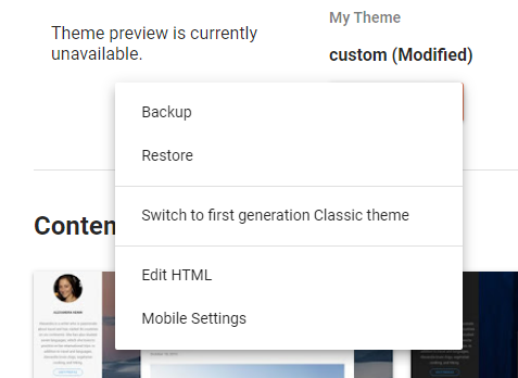
You should see a dropdown button used to customize your template. Click on the button and select Edit HTML.

Search (CTRL-F) to find the </head> element. Paste the following two elements just above the </head> element, making sure to use your Github Page URL.

<link href='https://{your site}.github.io/{your repository}/prism.css' rel='stylesheet'/>
<script src='https://{your site}.github.io/{your repository}/prism.js' type='text/javascript'/>
</head>

Save your template changes, and you are ready to start using Prism in your blog posts.

Important Information when using Prism with CSHTML / Razor code!!!

Directions on using Prism can be found on the Prism site. The general format you need to follow for CSHTML / Razor / Blazor code is:

<pre> <code class="language-razor"> {Your Razor code goes here} </code> </pre>

You cannot simply copy and paste your CSHTML code from your code editor. Prism will NOT process it correctly. Instead, you need to encode any special characters like angle brackets and ampersands as HTML entities. You could do this manually, but the simplest approach is to use an editor that has a feature for this purpose. I use Notepad++ for this purpose. Once you've downloaded and installed the editor, go to the Plugins menu item, select Plugins Admin and install the HTML Tag plugin. Using the this handy tool will greatly simplify your life. There may be an extension for Visual Studio (I believe there is one for Visual Studio Code) that can achieve the same encoding, but this was the approach I adopted for my work.